

The French National Geographic: Traveler magazine design for the Italie issue had potential for a redesign of its style to better fit an idealized aesthetic of Italian travel. The original cover features a level of vibrancy that does not mix well with the classic National Geographic brand and was lacking font consistency against a photo with which there was little interaction.


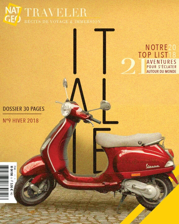
The new design style for the magazine explores how the typography can be brought into the image for a more dynamic layout. Some key elements of the National Geographic brand were reimagined to better fit the look of the redesign. The new system was carried into a number of concepts for spreads and a table of contents to explore some exciting new typography.


